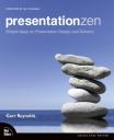
 After being impressed by Garr Reynolds speaking in Sydney a year or so ago, I’ve been keen to check out his Presentation Zen book. It is an enlightening read, especially if you have never studied art or graphics design. The book is a little over 200 pages long, with many illustrations and a impressive, clean layout (no surprise there!).
Near the start of the book, Garr talks about creativity requiring an open mind (child like) and a willingness to be wrong, and to experiment. He recommends exercising restraint, and focusing on simplicity, clarity and brevity. He starts presentations brainstorming using pen and paper, whiteboards or post-its rather than in front of the computer (personally I often use story cards as you can jot slide outlines on them, group, and shift the order around). He recommends grouping the ideas, and identifying the core message and sticking with that message throughout the whole presentation.
Garr highlights the importance of taking the time to slow down and really think about what to put in the presentation. He suggests that you keep two important questions in mind: “What’s your point?” (what one thing do you want the audience to remember), and “Why does it matter?” (put yourself in the audiences’ shoes). If bits of your content don’t aid in answering these questions, “when in doubt, cut it out”! Garr also suggests an “Elevator test” – can you make your pitch in 30-45 seconds? A structure that works well is starting with an introduction which explains the issue (the pain) and the core message. Then something like 3 parts that support your assertions or solve the pain (sounds a bit like Bosworth’s Solution Selling).
“Amplification through simplification” is central to Garr’s design approach. He advocates lots of empty space to highlight just one or a few important elements on a slide. “Simplicity can be obtained through the careful reduction of the non-essential” and decreasing the signal vs noise ratio of the slides. Garr is a big fan of using images on slides with just a few words. The aim is to make slides which have strong, memorable impact, and enhance the presenter’s spoken words. He also highlights the importance of having the audience know where to look. Eg, simplicity plus images leading the eye to the right spot (eg, people in images on the slide look towards the words on the slide). Garr is a big fan of using quotes to support his points.
Garr suggests a mix of symmetrical and asymmetrical slides. Symmetrical are more formal and static, where as asymmetrical slides are often more dynamic and interesting and activate empty space. He also suggests using a grid, such as the rule of thirds (2 horizontal and 2 vertical lines providing a grid of 9 equally sized boxes), with the main subject placed on one of the crossing points of the lines. Contrast (using colour, shape, space, etc) can be used to make an element stand out and helps the viewer “get” the point of the design quickly. Repetition can be used (eg, text on each slide in an image of a post-it) to provide a professional and unified look. Use proximity to group related objects.
Although Garr doesn’t talk about it explicity, his sample slides tend to make use of clever typography. Often lower case text, with most important part in a bigger font. A mix of colours and sizes and styles and sometimes rotations to add interest to the slides. Generally sans-serif fonts.
On presenting itself, Garr says you should be completely present – enthusiastic and completely focused on presentation that you are giving, lost in the moment. Nothing else. Although you may make mistakes, don’t dwell on them. Practice like mad to become confident and appear easy and natural for the presentation. However, remain flexible, aware and open to possibilities as they arise (being “in the moment”).
Near the end of the book, Garr says: “It’s not about us [the presenter], it’s about them. And about the message.”. He also suggests that shorter is better, leave the audience wanting more, not overloaded (as per Japanese proverb “eat until 80% full”). On delivery, Garr suggests standing front and centre, leaving the lights on and advancing slides with a remote.
Garr’s points are much more clearly illustrated using images in the book. I would recommend Presentation Zen to anyone who is interested in making more visually inspiring and interesting presentations.

yani
good review, sounds like an interesting read, even tho I don’t make presentations